
How to choose the right white
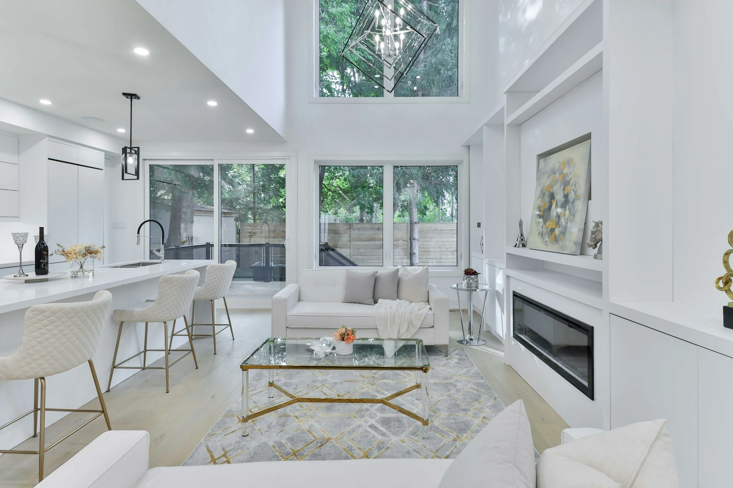
As an interior designer, choosing the right white is one of the most common areas I help clients with. It's also one of the colours that causes the most frustration because what looks perfect in the paint store can look completely different once it's on your walls.
A white that looked crisp and fresh in the showroom suddenly feels blue in your living room. Or perhaps the colour you expected to look soft and warm ends up looking creamier than you imagined.
In this guide, I'll explain why white paint can be so tricky, what influences how it looks in your home, and how to confidently choose a white that feels timeless and beautifully suited to your space.
In This Guide
Why choosing white paint is harder than it seems
Understanding undertones
Why natural light changes everything
Looking at your home's fixed finishes
How to test white paint correctly
How to create depth with white
Frequently asked questions
Lianne's Design Tips
Why White Paint Isn't "Just White"
One of the biggest misconceptions is that white paint is simply… white. In reality, every white has a subtle undertone that influences how it appears once it's covering an entire wall. Those undertones are what give a white its personality. Some feel warm and inviting. Others feel crisp and contemporary. Some are beautifully balanced and versatile.
The challenge is that those undertones are often almost impossible to see on a tiny paint chip. Once they're painted across a large wall, however, they become much more obvious. This is why homeowners are often surprised when the white they chose in store looks completely different at home.
Understanding Undertones
Before you choose a white, it's helpful to understand the three main undertone families.
Warm Whites
Warm whites contain subtle hints of yellow, cream or soft red. These whites generally create interiors that feel relaxed, welcoming and comfortable. They're particularly well suited to homes with warm timber flooring, natural stone and earthy materials.
Cool Whites
Cool whites have undertones of blue, grey or occasionally green. They often suit contemporary homes and pair beautifully with cooler stones, polished concrete and modern finishes. However, in some lighting they can feel sharper than expected, which is why testing them at home is so important.
Neutral Whites
Neutral whites sit comfortably between warm and cool. They're often incredibly versatile because they don't lean too heavily in either direction. For many homes, a neutral white provides the flexibility to work with a variety of finishes while still feeling soft and timeless.
Designer Insight From Lianne
Don't choose your white because someone else used it successfully. The same paint colour can look completely different from one home to another because every home has different natural light, flooring, cabinetry and furnishings. Always choose a white that's right for your home—not someone else's.
Why Natural Light Changes Everything
Light is probably the biggest reason white paint surprises people. The same white can change dramatically throughout the day as the light changes. Morning light, afternoon sun, overcast days and warm evening lighting. Each one influences how your paint colour appears.
Room orientation also plays a significant role. A north-facing room receives very different natural light from a south-facing room, which means the same white may feel warm in one space and noticeably cooler in another. This is why I always encourage clients to spend time observing their samples over several days rather than making a decision after just one look.
Paint is a significant investment in both time and money, so it's worth slowing the process down just enough to feel confident in your choice.
Work With Your Existing Finishes
One of the easiest ways to narrow your choices is to stop looking at paint first. Instead, start by looking at what's already in your home.
Ask yourself:
What colour is my flooring?
Are my kitchen cabinets warm or cool?
What undertones are in my benchtops?
What colour are my tiles?
Am I replacing my furniture, or keeping it?
These fixed finishes should guide your paint selection, not compete with it. When everything shares similar undertones, the result feels calm, balanced and effortlessly cohesive.
Test Your White Paint Properly
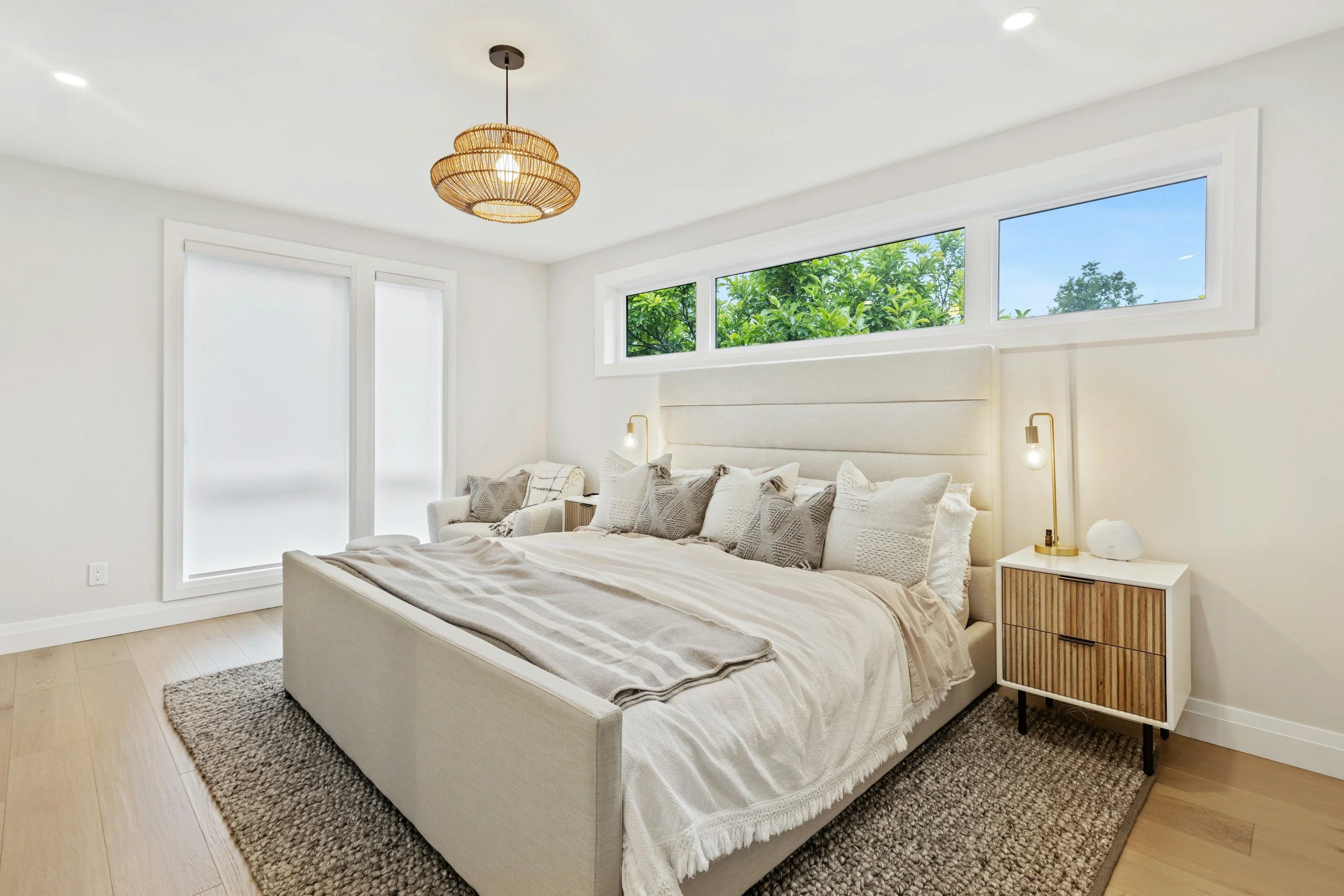
By the time you've narrowed your selection down to two or three whites, it can be tempting to paint a few squares directly onto the wall and make your decision. I actually recommend a different approach.
Designer Insight from Lianne
Rather than painting your samples directly onto your walls, paint each colour onto an A3 or A4 sheet of white card or heavy paper, leaving a white border around the painted area. There are two reasons I recommend this. Firstly, the existing wall colour can influence how your sample appears. By leaving a white border around the painted section, you're isolating the new colour, making it much easier to see its true undertone.
Secondly, your sample becomes portable. You can move it around the room, pin it to different walls and even take it into adjoining rooms to see how it looks in different spaces and lighting conditions. It's a much more accurate way of assessing colour, and you won't be left with multiple paint patches on your walls.
One extra tip that I always share with clients is to place the sample into the corner of the room. The corner allows the colour to reflect off itself, giving you a far better indication of how it will look once the entire room has been painted. It's a simple trick, but one that can make choosing between two very similar whites much easier.
If You Love an All-White Home, Create Depth, Not Contrast
One of the biggest myths is that an all-white interior means using the exact same white on every surface. In reality, that's often what makes a room feel flat.
The most successful all-white interiors rely on subtle variation.
Designer Insight from Lianne
If you've found a white you love, consider using different strengths of that colour, or a complementary white with the same undertone.
For example:
Full strength on the walls.
Half strength on doors, trims and skirting boards.
A lighter version, or a complementary white, on the ceiling.
These subtle shifts create gentle layers and depth without introducing obvious contrast. The result is an interior that feels calm, cohesive and beautifully considered.
Another point that's often overlooked is the ceiling.
Because ceilings receive less reflected light than walls, they can actually appear darker when painted in exactly the same colour. Choosing a lighter white overhead helps keep the room feeling fresh, balanced and more spacious.
Common Mistakes When Choosing White Paint
Even with the best intentions, there are a few mistakes I see homeowners make time and time again.
Choosing white in the paint store
Paint stores are a great place to narrow down your options, but they shouldn't be where you make your final decision. Lighting in a showroom is completely different from the lighting in your home. Always test your shortlisted colours in the rooms where they'll be used.
Choosing a white because it's popular
Just because a particular white is trending doesn't mean it's the right choice for your home. The best white is the one that works with your flooring, cabinetry, natural light and overall style not necessarily the one everyone else is using.
White paint changes throughout the day. Take the time to observe your samples in the morning, afternoon and evening, and on both sunny and overcast days. You'll be amazed at how different the same colour can look.
Forgetting to consider adjoining spaces
If your home is open plan, it's important to think beyond one room. Ask yourself how your chosen white will flow into the kitchen, dining area, hallway and adjoining living spaces. A cohesive home isn't about making every room identical, it's about ensuring they feel connected.
Before You Make Your Final Decision
Before ordering your paint, ask yourself these questions:
✔ Have I tested at least two or three whites?
✔ Have I viewed them at different times of the day?
✔ Have I compared them with my flooring, cabinetry and stone?
✔ Have I checked how they look in a room corner?
✔ Have I considered how they'll connect with adjoining rooms?
✔ Have I decided whether to use different strengths for walls, trims and ceilings?
Frequently Asked Questions
What is the best white paint for a home?
There isn't one universally "best" white. The right choice depends on your home's natural light, existing finishes and the atmosphere you want to create.
Should I use the same white throughout my house?
Often, yes—but not always.
Using the same white throughout can create wonderful continuity, particularly in open-plan homes. You can then add personality through furnishings, artwork and accessories.
Why does my white paint look grey?
Grey or blue undertones often become more noticeable in rooms with cooler natural light or when paired with cool-toned flooring and finishes.
Why does my white paint look yellow or creamy?
Warm undertones become more obvious in certain lighting conditions, particularly when paired with warm timbers or warm artificial lighting.
Should ceilings be painted the same white as the walls?
Not necessarily. Using a lighter version of your wall colour, or a complementary white with the same undertone, can help the ceiling feel brighter and create a subtle sense of height and openness.
Final Thoughts
Choosing white paint is rarely as simple as it first appears. Once you understand undertones, natural light and how your existing finishes influence colour, the process becomes much more manageable. Taking the time to test your options properly and choosing a white that's suited to your home, not just the latest trend, will reward you every time you walk through the door.
A well-chosen white creates the perfect backdrop for everything else in your home. It allows your furniture, artwork, textures and personality to shine while bringing a sense of calm and cohesion to the spaces you live in every day.
Feeling Unsure About Choosing the Right White?
If you've narrowed your choices down but still can't decide, an independent opinion might be all it takes to avoid an expensive mistake and move forward with confidence.
Whether you're choosing paint for one room or planning a complete renovation, I'd be delighted to help you create a colour palette that feels timeless, cohesive and perfectly suited to your home.