
How to choose a colour palette for your home.
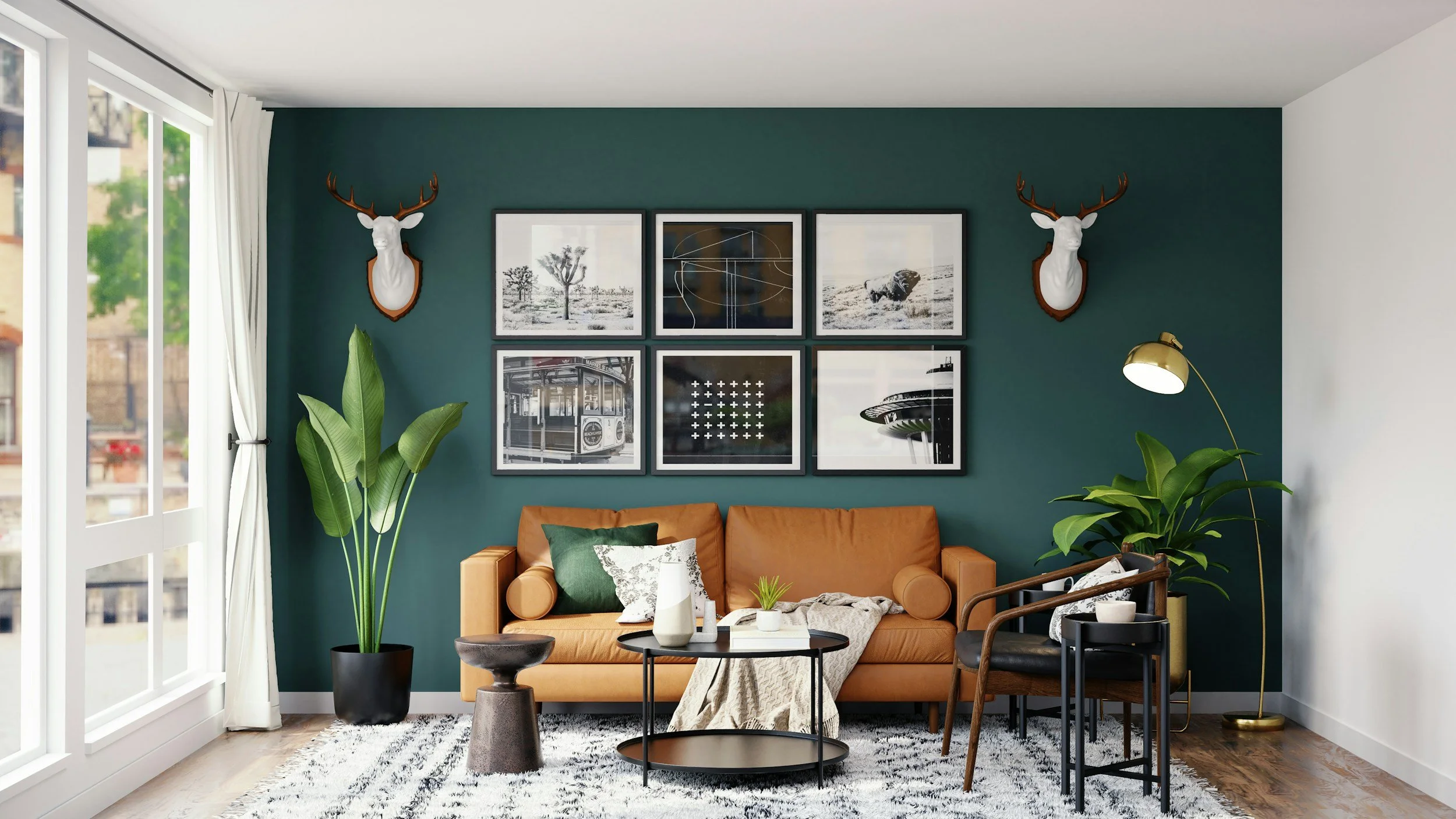
Choosing colours for your home should be exciting. Instead, for many people, it's one of the most overwhelming parts of renovating or decorating. Standing in front of hundreds of paint swatches, and wondering whether your flooring, sofa and cabinetry will actually work together can quickly turn what should be a fun experience into a stressful one.
One of the first things I help clients with is simplifying what can feel like hundreds of decisions. Once there's a clear direction, those decisions become much easier, and choosing colours becomes something to enjoy rather than something to worry about.
In this guide, I'll walk you through exactly how I approach colour selection with my clients so you can make confident decisions and create a home that feels beautifully connected from room to room.
In This Guide
Why choosing colours feels so overwhelming
Start with how you want your home to feel
Work with your home's fixed finishes
Understand undertones before choosing paint
How many colours should you use?
Why testing paint properly matters
How to create flow throughout your home
Frequently asked questions
Lianne's top colour tips
Why Choosing Colours Feels So Overwhelming
Have you ever noticed that the more options you have, the harder it becomes to choose? Colour is a perfect example. Paint companies offer hundreds, sometimes thousands of colours, and online inspiration is endless. Pinterest, Instagram and home magazines are wonderful sources of ideas, but they can also leave you wondering why every image looks so different.
Another challenge is that colour never exists on its own.
The same paint colour can look completely different depending on:
Natural light
The direction your room faces
Flooring
Cabinetry
Window furnishings
Furniture
Artificial lighting
That's why the colour your friend used, or the one you loved in a showroom, may not look the same in your own home. There are many factors influencing how those colours appear. Understanding this takes away a lot of the pressure.
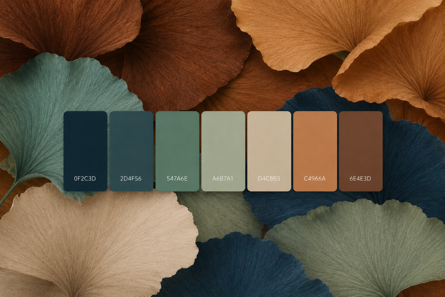
Step One: Think About How You Want Your Home to Feel
One of the biggest misconceptions about interior design is that colour comes first. It doesn't. One of the first questions I ask my clients is "How do you want your home to feel?"
Beautiful interiors aren't created by chasing trends. They're created by designing around the lifestyle and atmosphere you want to enjoy every day.
For example:
Do you want your home to feel...
Calm and relaxing after a busy day?
Warm and welcoming for family and friends?
Fresh and light-filled?
Sophisticated and elegant?
Cosy during winter?
Bright and energising?
Notice that none of those questions involve a colour. That's because colour is there to support the feeling, not create it on its own. Once you've identified the atmosphere you're trying to achieve, your colour choices become much more obvious.
Designer Insights From Lianne
Rather than collecting hundreds of inspiration photos, choose five or six rooms that all give you the same feeling.
Don't analyse the colours just yet.
Instead, ask yourself:
"What is it about these spaces that I love?"
You'll often discover that you're consistently drawn to similar tones, textures and materials without even realising it.
Step Two: Work With What's Staying
One of the most common mistakes homeowners make is choosing paint before everything else. I actually recommend the opposite. Look around your home and identify the elements that aren't changing.
These are often your biggest investment pieces, such as:
Timber flooring
Carpet
Kitchen cabinetry
Stone benchtops
Splashbacks
Tiles
Fireplaces
Large furniture
These fixed finishes become the foundation of your colour palette. For example, if your timber flooring has warm honey or oak tones, introducing a cool blue-grey white on the walls may create an uncomfortable contrast. Likewise, a beautiful cool-toned stone benchtop can lose its impact if it's paired with creamy, yellow-based whites. When your finishes and paint colours share similar undertones, the entire home feels naturally cohesive. One decision supports the next.
Step Three: Understanding Undertones
If you've ever looked at two white paint samples and thought they looked exactly the same, until you put them side by side, you've already experienced undertones. Every colour has an undertone. Generally speaking, undertones fall into three categories:
Warm undertones
Warm whites often contain hints of cream, yellow or soft red. These colours create spaces that feel inviting, comfortable and relaxed.
Cool undertones
Cool whites usually contain subtle blue, grey or green influences. They often suit contemporary homes and create a crisp, fresh feeling.
Neutral undertones
Neutral whites sit comfortably between warm and cool. They're incredibly versatile and often provide a softer alternative to very cool whites.
Understanding undertones is one of the biggest differences between a room that feels professionally designed and one that never quite feels "right."
The individual colours might all be beautiful—but if their undertones don't relate to one another, something will always feel slightly off.
Step Four: Keep Your Colour Palette Simple
One of the biggest misconceptions is that a beautifully designed home needs lots of colours to make it interesting. In reality, it's often the opposite. Some of the most timeless interiors rely on a carefully edited palette that allows texture, natural materials and thoughtful styling to do the talking. A simple colour palette also makes your home feel calmer and more connected.
As a general guide, I recommend choosing:
One main colour – This is typically your wall colour and forms the backdrop to your home.
One or two supporting colours – These add depth and work across larger pieces such as upholstery, cabinetry or flooring.
One or two accent colours – Introduced through cushions, artwork, accessories or occasional furniture, these bring personality and can be updated over time.
Keeping your palette intentionally simple doesn't mean your home will feel boring. In fact, it often has the opposite effect. When colours relate to one another, each piece has room to shine without competing for attention.
Should Every Room Be the Same Colour?
The short answer is... not necessarily. What matters more is that your colours feel connected. If every room is a completely different colour, your home can start to feel disjointed, particularly in open-plan spaces where several rooms are visible at once. Instead, think about creating a common thread.
You might use the same wall colour throughout much of the home and introduce different accent colours in each room. Or you may vary the wall colours slightly while keeping the same undertones and repeating key materials, fabrics and finishes. The goal isn't for every room to look identical, it's for your home to tell one cohesive story.
Step Five: Test Paint the Right Way
Choosing a paint colour from a tiny sample chip is a little like buying a sofa after only seeing a photograph.
This is one of the areas where a small change in your approach can make a huge difference.
Designer Insight From Lianne
Rather than painting samples directly onto your walls, paint your shortlisted colours onto A3 or A4 sheets of white paper or card, leaving a white border around the painted area. Why?
Because the existing wall colour can influence how your new colour appears. By leaving a white border, you're isolating the sample, allowing you to see the colour much more accurately.
It also means you can:
Move your samples around the room.
View them in morning, afternoon and evening light.
Compare them in different rooms.
Avoid ending up with patchy walls covered in test squares.
One extra step I always recommend is placing the sample into the corner of the room. Corners allow the colour to reflect off itself, giving you a much better understanding of how it will feel once it's covering the entire space. It's a simple trick, but it's one that can completely change your confidence before making a final decision.
Step Six: If You Love White, Create Depth Rather Than Contrast
Many homeowners fair colour and simply want to stick with white on the walls. More recently many of my clients are stipulating warm whites. The key is to create depth through using different shades of the chosen colour or colours with similar undertones.
Lianne's Design Tip
Instead of using one white throughout, consider using different strengths of the same white, or a complementary white with the same undertone.
For example:
Full strength on the walls.
Half strength on doors, trims and architraves.
An even lighter white on the ceiling.
This creates subtle layers and depth while maintaining a beautifully calm, cohesive look. It's also worth remembering that ceilings naturally receive less reflected light than walls. Using exactly the same white on both can sometimes make the ceiling appear darker than the walls.
Choosing a lighter white overhead helps maintain balance and keeps the room feeling fresh, spacious and bright. These are subtle differences that most people won't consciously notice—but they'll definitely notice how good the room feels.
Step Seven: Bring Everything Together
Once you've selected your colours, the final step is repeating them thoughtfully throughout your home.
A cohesive home doesn't rely on every room looking identical.
Instead, it relies on visual connections.
That might be:
Repeating the same timber tone in different rooms.
Carrying accent colours through artwork and cushions.
Using similar metal finishes throughout.
Introducing complementary textures and fabrics.
These repeated elements create rhythm, helping each room feel like part of a considered whole.
One thing I often remind clients is that good design isn't about making every room the star of the show.
It's about creating a home where each space naturally leads to the next.
Quick Recap
When choosing a colour palette for your home:
✔ Start with how you want your home to feel.
✔ Work with your existing flooring, cabinetry and fixed finishes.
✔ Understand whether your home suits warm, cool or neutral undertones.
✔ Keep your palette simple and cohesive.
✔ Test paint on removable A3 or A4 boards—not directly onto your walls.
✔ View samples throughout the day and place them in room corners.
✔ If you're using white, create subtle depth by using different strengths and a lighter ceiling colour.
✔ Repeat colours and materials throughout your home to create flow.
Frequently Asked Questions
What is the easiest way to choose a colour palette?
Start by identifying how you want your home to feel, then work with your existing finishes such as flooring, cabinetry and stone. Once those decisions are made, choosing paint becomes much simpler.
How many colours should I use throughout my home?
A well-balanced home usually relies on one main colour, one or two supporting colours and one or two accent colours. Keeping your palette simple creates a more timeless and cohesive result.
Should every room in my home be the same colour?
Not necessarily. The colours should relate to one another through similar undertones or repeated materials, but each room can still have its own personality.
Why does my paint colour look different at home?
Natural light, room orientation, surrounding materials and artificial lighting all influence how a paint colour appears. That's why testing paint in your own home is so important.
Is white the safest paint colour?
Not always. White is one of the most difficult colours to get right because every white has an undertone. Taking time to understand those undertones will help you choose a white that complements your home.